If you sell food across multiple European cities, you’ve likely learned that one size rarely fits all. Taste is cultural—and so is visual taste. This guide breaks down what wins in London, Paris, and Madrid, so your menu images stand out on delivery apps and your own channels. We’ll keep it practical, grounded in what diners respond to, and tailored to real-life constraints. Consider it your field manual for menu photography Europe.
Menu photography Europe: the city-by-city playbook
Europe isn’t a monoculture. The best images flex to local expectations while staying on brand. Three truths help everywhere:
- Lead with appetite appeal first, brand second.
- Make the hero crystal-clear at thumbnail size.
- Keep crops platform-proof with generous safe margins.
From there, refine per city.
London: clarity, abundance, and texture
London diners reward clarity and no-nonsense generosity. Think bold, well-lit dishes that look plentiful and deliver on the promise.
What performs well:
- Angle: 45° or top-down for bowls and trays; 45° for burgers, sandwiches, and stacked items to show layers.
- Lighting: bright, neutral to slightly warm; avoid heavy shadows that obscure edges.
- Composition: tight framing on the hero, minimal props; a ramekin or sauce drizzle can suggest value without clutter.
- Texture cues: crisp edges on fries, visible grill marks, glossy sauces; show the “crunch” or “melt.”
What to avoid:
- Over-stylized tableaus that hide the portion size.
- Messy garnishes that read as untidy at small sizes.
Positioning note: London’s competitive delivery scene pressures thumbnails to do more work. Keep backgrounds clean (light gray, pale wood, or soft color fields) so contrast is high at a glance.
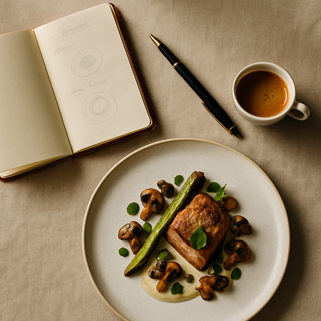
Paris: restraint, plating, and provenance
In Paris, restraint reads as confidence. Diners often respond to elegant plating, natural light, and credible ingredient stories.
What performs well:
- Angle: 45° for plated mains; gentle top-down for pastries, tarts, and symmetrical items.
- Lighting: soft, natural, with subtle shadows; avoid heavy saturation and artificial shine.
- Composition: negative space and crisp rims; a linen fold or a single herb sprig is enough.
- Story cues: a visible label on an artisanal element, or a recognizable regional ingredient, used sparingly.
What to avoid:
- Oversized props or bright, clashing backgrounds.
- Excessive saucing or heavy glazes that feel unnatural.
Positioning note: Maintain elegance without drifting into minimalism that under-sells the portion. Paris rewards tastefulness, not austerity.
Madrid: warmth, sharing, and appetite appeal
Madrid leans convivial. Warm tones, generous portions, and the suggestion of sharing make people hungry.
What performs well:
- Angle: 45° for depth on raciones and mains; top-down for tapas boards and paella to communicate variety.
- Lighting: warm and lively; avoid extreme contrast that hides color.
- Composition: a touch of rusticity—ceramic plates, parchment, or a wooden surface—kept tidy and bright.
- Action cues: a torn croqueta showing the filling, a spoon in the arroz; subtle motion sparks appetite.
What to avoid:
- Cool, clinical lighting that flattens reds and yellows.
- Overcrowded spreads where the hero isn’t obvious.
Platform realities: Uber Eats, Glovo, Just Eat
Delivery platforms update specs frequently, but industry guidelines indicate common ranges: square thumbnails (1:1) are widespread, while banners and category headers often lean 4:3 or 16:9. To future-proof:
- Shoot wider than you think, with at least 10–15% safe margin around the subject to survive crops.
- Keep the hero centered and large enough to read at small sizes.
- Export sRGB JPEGs; aim for high resolution (industry docs commonly recommend short edges ~1500–2000px+) without excessive compression.
- Avoid text overlays and tiny props that will vanish in thumbnails.
Always verify the latest specs in your dashboard before bulk uploads—platforms evolve.
Lighting, styling, and file specs that travel well
- Color temperature: 5000–5600K daylight-balanced light keeps colors consistent across devices.
- Diffusion: a softbox or window light with diffusion reduces harsh highlights on glossy foods.
- Consistency: lock white balance for a session; batch-edit to align hues across SKUs.
- Sharpening: add light, global sharpening for thumbnails; avoid crunchy halos.
- Hygiene: wipe rims, manage crumbs deliberately, and style sauces with intent.
Mini case study: one brand, three cities, three tweaks
A fast-casual bowl brand operating in London, Paris, and Madrid struggled with uneven results from a single global photo set. They tested localized adjustments over four weeks:
- London version: tighter 45° crops, brighter key light, and a visible protein hero on top.
- Paris version: calmer palette, negative space, and a restrained herb garnish; no utensil clutter.
- Madrid version: slightly warmer grade, a shareable top-down with visible variety, and a spoon resting in the bowl.
Outcome: the team reported clearer thumbnails, fewer platform rejections for cropping, and a noticeable lift in on-platform engagement. While exact percentages vary by category and season, industry reports indicate that clearer hero subjects and localized styling correlate with improved click-through and conversion. The qualitative feedback matched the data: “Looks more generous” in London, “More refined” in Paris, and “Hungry now” in Madrid.
Execution checklist for cross-city consistency
- Define your hero: what must be visible at 1:1 and 120–200px wide?
- Lock angle families: 45° for layered items; top-down for spreads and bowls.
- Build a prop kit per city: neutral wood/linen for London, minimal ceramics for Paris, warm rustic for Madrid.
- Calibrate color: daylight white balance; adjust warmth per market.
- Crop once, export many: set master crops with safe margins; generate platform-specific outputs from one source.
- Test weekly: rotate at least 2 thumbnails per city for a core seller to monitor engagement.
Where FoodFix fits
Scaling this across cities is hard without a system. FoodFix makes it straightforward: consistent, on-brand images adapted to each market’s visual cues, delivered fast. With transparent pricing (€1.5 per shot), a Pro plan at €45/month for 30 photos, a €225 full‑menu package, and a 99‑second turnaround for generated shots, you can refresh quickly without booking crews.
FoodFix also standardizes crops, color profiles, and angle families so you’re not reinventing the wheel per SKU. That means fewer rejections, clearer thumbnails, and a library you can reuse across Uber Eats, Glovo, Just Eat, and your own site.
Get fast, localized visuals for London, Paris, and Madrid with FoodFix.
FAQ
What image dimensions work best across platforms in Europe?
Industry documentation suggests square thumbnails are common (1:1), with banners leaning 4:3 or 16:9. Export sRGB JPEGs with at least ~1500–2000px on the short edge to maintain clarity. Shoot wider and keep the hero centered to survive auto-crops.
Should I use white or textured backgrounds?
Use what supports the city’s cue and your brand: clean, light surfaces for London clarity; minimal, refined ceramics for Paris; warm, tidy rusticity for Madrid. Whichever you choose, maintain contrast so the hero reads at thumbnail size.
How often should I refresh menu photos?
Aim for quarterly refreshes on top sellers, or sooner if you change recipes, packaging, or plating. Seasonal items should be photographed at launch. Industry reports indicate that fresh imagery aligns with improved engagement during promotions and menu changes.
How do I test what works in London vs Paris vs Madrid?
Run controlled A/B tests on thumbnails: one variable at a time (angle, warmth, crop). Rotate weekly and log click-through and add-to-cart. For menu photography Europe specifically, keep a shared master file and export localized variants to isolate learnings without fragmenting your brand.
FoodFix can support structured testing by producing consistent variants on demand, then standardizing the winning look across your catalog.