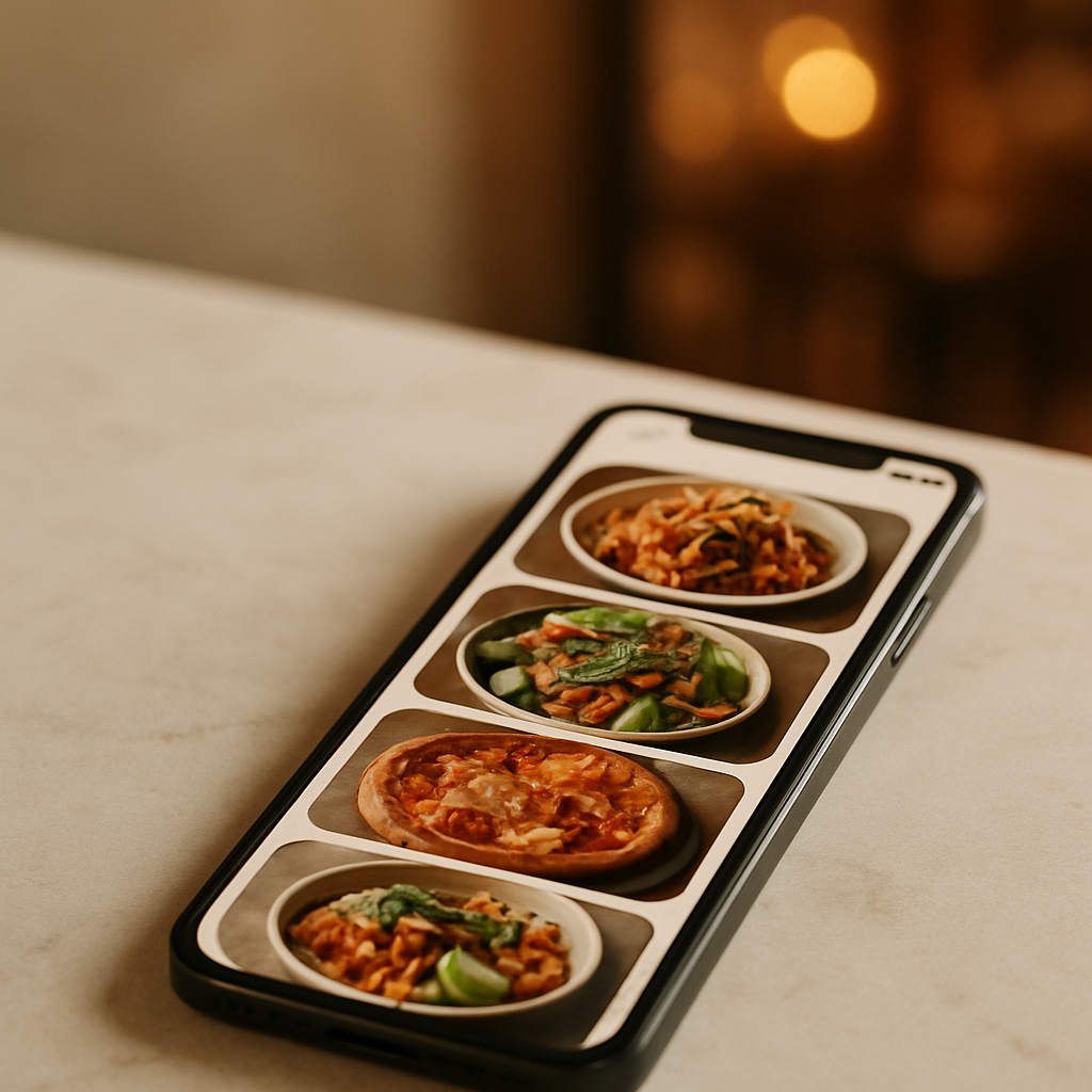
If your Just Eat listing isn’t earning the clicks it deserves, start with images. This just eat photo checklist distills what actually moves the needle: clarity, consistency, and speed. When time or budget is tight, FoodFix gives restaurants production-ready photos for marketplaces—fast and affordably—so you can refresh your menu without the photographer overhead.
Why strong photos win on Just Eat
- They reduce choice friction: clear visuals help diners decide faster and with more confidence.
- They elevate perceived quality: neat plating, accurate color, and appetizing texture signal care.
- They improve menu scan-ability: consistent angles and backgrounds make browsing effortless.
Operators commonly report higher click-through and better basket composition when photos are bright, consistent, and true-to-dish. While individual results vary by market and category, industry reports indicate that upgraded visuals correlate with stronger conversion across delivery apps.
Just Eat photo checklist: the essentials
Use this practical checklist to produce standout menu images that travel well across Just Eat—and re-use cleanly on Uber Eats and Glovo.
1) Resolution and sharpness
- Aim for high-resolution files so images stay crisp on modern phones: a long edge in the 1,200–2,000 px range generally works across marketplaces.
- Keep the subject tack-sharp. Soft, noisy, or compressed images get skimmed past.
- Disable aggressive in-camera filters; they often over-smooth textures like fried coatings or herbs.
2) Aspect ratio and framing
- Most listings present images in square or slightly rectangular cards. Compose to a safe center, keeping the hero dish inside a central 1:1 area.
- Leave breathing room. Tight crops that touch edges feel cramped and risk platform auto-cropping.
3) Lighting that flatters food
- Use soft, directional light from one side. A window or diffused LED panel beats harsh overhead lighting.
- Avoid mixed color temperatures (e.g., daylight window + warm kitchen strip). Set white balance once and stick to it.
- Add a white bounce card opposite your key light to lift shadows and keep sauces glossy.
4) Color accuracy and editing
- Match the dish, not the trend. Mild contrast, natural saturation, and clean whites keep expectations realistic.
- Correct color casts (green from fluorescents, orange from tungsten). White rice or a plate rim is a good reference.
- Export high-quality JPEG or PNG with minimal compression artifacts.
5) Composition that sells
- Angle: 45° three-quarter or top-down works for most plates; 15°-30° for burgers and layered builds.
- Fill the frame with the hero; supporting elements (dips, bread, sides) should complement, not clutter.
- Garnish with intent. A pinch of chopped herbs or a lemon wedge adds life; avoid random salad confetti.
6) Backgrounds and props
- Keep it neutral and brand-aligned: light wood, slate, parchment, or a clean tabletop.
- Limit palette to 2–3 tones. Busy patterns distract and may clash with app UI.
- Use brand cues sparingly (branded wrap, signature bowl) to differentiate without overwhelming.
7) Consistency across the menu
- Lock a repeatable setup: same angle family, similar distance, uniform color balance.
- Shoot in sets by category (pizzas, bowls, desserts) to maintain internal coherence.
- Build a mini style guide: angle, lens/zoom, background, light placement, editing notes.
8) Truth-in-advertising
- Style the dish exactly as served, with portion sizes and components shown honestly.
- Show delivery reality: if a drizzle, topping, or side comes packaged, present it that way.
9) File hygiene for upload
- Use clear file names (category_dish-variant.jpg) to speed mapping in Just Eat’s portal.
- Keep master files organized by category/date; batch export web copies to a single folder for upload.
10) Accessibility and clarity
- If the platform allows alt text or descriptions, use concise, vivid language that reflects the image.
- Avoid text overlays on images; they can be cropped or look cramped in cards.
FoodFix fits this checklist by producing naturally lit, brand-consistent shots at scale—so you can refresh or expand menus without re-learning photography each season.
Prep and styling that survive delivery
- Plate for the journey: emphasize elements that stay crisp or creamy. If steam fogs lenses, let dishes settle 1–2 minutes before shooting.
- Sauce strategy: brush or spoon sauces where they add shine and structure; avoid soupy pools that read as greasy.
- Texture first: highlight crunch (fried edges, toasted crumbs) and moisture (glossy glazes, juicy cuts) with side light.
- Color contrast: pair warm foods with cool backdrops (or vice versa) to make colors pop without oversaturation.
- Portion discipline: overfilling bowls reads messy on-camera; underfilling looks stingy. Level the hero component and tuck sides neatly.
Workflow: from kitchen pass to Just Eat listing
- Batch production: shoot in menu groups to maintain consistency and reduce setup changes.
- Tether or review at 100% on a phone: if it isn’t sharp and appetizing on a small screen, reshoot.
- Standardize edits: apply the same white balance and curve preset across the set.
- Final review: scroll your images in a grid. Remove outliers that break the visual rhythm.
- Upload and map: pair each image to the correct SKU/variation in your Just Eat back office; preview on mobile before publishing.
When speed matters, FoodFix streamlines this entire loop with a 99‑second turnaround, so seasonal specials or last-minute menu changes can go live the same day.
Mini case study: from “good enough” to irresistible
A neighborhood pizzeria had a solid rating but flat new-customer orders. Their menu photos were dim, inconsistent angles, and some dishes had no images at all. We rebuilt their set with this checklist: soft side light, consistent 45° angle for mains, top-down for shared starters, neutral slate background, and honest cheese stretch shots at peak melt. Captioning in the portal matched exact variants (Margherita, Diavola, Funghi). Within a week, staff reported fewer “what’s on this pizza?” calls and more add-on dips per order—evidence of clearer visuals guiding choices. FoodFix then replicated the style across their Just Eat, Uber Eats, and Glovo menus, keeping the brand look consistent without extra shoots.
DIY or outsource? How to choose the smart path
- Choose DIY when: you have stable lighting, a prepared shooting corner, and time to create a repeatable style for 10–20 dishes.
- Choose a service when: you need speed, uniformity across locations, or you’re refreshing images often (seasonal menus, LTOs, new packaging).
FoodFix is built for restaurants that want production-ready images without the overhead of a traditional shoot. Pricing stays predictable—€1.5 per shot for pay‑as‑you‑go, a €45/month Pro plan with 30 photos, or a €225 full‑menu package—and the 99‑second turnaround keeps your listing current across Just Eat and other delivery apps. Ready to upgrade your visuals and publish faster? Try FoodFix.
Pro tips to lift basket value
- Show complements: include a tasteful ramekin of house dip or a side that pairs naturally; keep it secondary to the hero.
- Clarify variants: photograph size tiers or heat levels once, and use consistent visual cues (pepper flakes, extra toppings) to distinguish.
- Seasonal swaps: reshoot garnishes and produce-heavy dishes when seasons change to keep colors vivid and accurate.
- Minimize reflections: matte plates and a slight polarizer on-camera reduce specular highlights on soups, glazes, and shiny packaging.
FAQ
What image size works best for Just Eat?
Marketplaces commonly display square or near-square cards. A long edge in the 1,200–2,000 px range generally stays sharp on modern devices. Compose to a safe center so auto-cropping doesn’t cut the hero.
Can I reuse the same photos on Uber Eats and Glovo?
Yes. If you follow this checklist—central composition, neutral backgrounds, and high resolution—you can repurpose the same set across Just Eat, Uber Eats, and Glovo with minimal or no cropping.
Do lifestyle shots perform better than clean menu shots?
For the product card, clean, well-lit dish photos usually work best. Lifestyle or context shots can support banners and social, but on listing cards, clarity and consistency typically win.
How many photos per dish should I upload?
Start with one strong, representative image per dish. Add a second angle only if it clarifies a key feature (cross-section of a wrap, toppings detail) and stays consistent with your overall style.
Should I edit heavily or keep it natural?
Keep edits light and honest—accurate color, modest contrast, and clear texture. Heavy filters can misrepresent the dish and lead to mismatched expectations on delivery.
What if I don’t have a good shooting space?
Create a small, repeatable setup: a portable background, one diffused light source, and a bounce card. If that’s not practical, FoodFix provides consistent, on-brand images without you building a studio.
Strong images turn browsing into ordering. Use this Just Eat photo checklist to tighten your look, keep it honest, and publish fast—so your menu always matches the appetite of the moment.